What Makes a Website Feel Premium? 10 Essential Design Elements
Discover the essential elements of premium website design, from visual hierarchy and typography to responsive layouts, smooth animations and performance optimization.
 By Raghav Pimple 7 min read
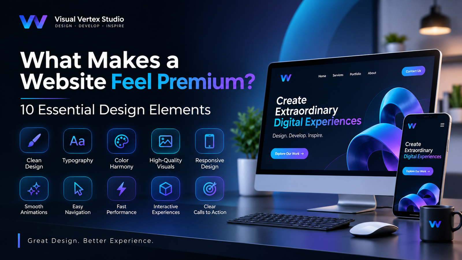
What Makes a Website Feel Premium? 10 Essential Design Elements.
A website is often the first interaction customers have with a business. Before contacting a company, exploring its services or making a purchase, visitors usually form an impression based on its website.
But what makes one website look ordinary while another feels professional, modern and premium?
The answer is not simply expensive graphics or attractive colors. A premium website combines thoughtful design, smooth interactions, intuitive navigation, strong performance and a consistent visual identity.
Whether you are building a business website, portfolio, landing page or digital product, understanding these design principles can help you create a better online experience.
Let's explore ten essential elements that make a website stand out.
1. Clean and Minimalist Design
A premium website does not need to display everything at once. Instead, it focuses on the information visitors actually need.
Minimalist design uses whitespace, balanced layouts, carefully selected colors and clear content sections to create an organized experience.
Why does it matter?
- Makes information easier to understand.
- Reduces unnecessary visual distractions.
- Highlights important content.
- Creates a professional brand impression.
The goal is not to remove everything from a website. It is to give every design element a clear purpose.
2. Strong Typography and Readability
Typography plays a major role in website appearance. The right fonts can communicate personality, establish visual hierarchy and make content easier to read.
A professional website should use a consistent typography system.
Consider these practices:
- Use no more than two or three complementary font families.
- Create clear differences between headings and paragraph text.
- Maintain comfortable line spacing.
- Choose readable font sizes for mobile devices.
- Use font weights consistently.
For example, a bold heading combined with a clean sans-serif paragraph font can create a modern and sophisticated appearance.
3. Consistent Color Combinations
Colors influence how visitors perceive a brand.
A website with too many unrelated colors can look confusing, while a carefully planned color palette creates visual consistency.
A useful color system generally includes:
- Primary color for branding and important elements.
- Secondary color for supporting sections.
- Accent color for buttons and highlights.
- Neutral colors for backgrounds and text.
Consistency is more important than using a large number of colors.
4. High-Quality Images and Visual Elements
Images are among the first things visitors notice when opening a website.
Low-resolution images, inconsistent graphics and poorly cropped visuals can make an otherwise good website feel unprofessional.
Businesses can improve their website visuals through:
- Professional photography.
- Custom illustrations.
- High-quality product renders.
- 2D and 3D visualizations.
- Carefully optimized background images.
For businesses showcasing products, architecture or creative work, high-quality 3D rendering can help communicate details that ordinary images may not capture.
5. Responsive Design for Every Device
Visitors access websites through smartphones, tablets, laptops and desktop computers.
A premium website should provide a consistent experience across all screen sizes.
Responsive design ensures that:
- Layouts adjust to different screen dimensions.
- Text remains readable.
- Images scale appropriately.
- Navigation works on mobile devices.
- Buttons and interactive elements remain accessible.
Mobile responsiveness should be considered from the beginning of the design process rather than added as an afterthought.
6. Smooth Animations and Micro-Interactions
Animations can make a website feel more engaging when they are used thoughtfully.
Examples include:
- Smooth scrolling.
- Hover effects on buttons.
- Subtle image transitions.
- Animated navigation menus.
- Scroll-based reveal effects.
- Interactive background elements.
However, excessive animation can distract visitors and affect performance.
The best approach is to use animation to support the user experience rather than compete with the content.
7. Easy Navigation and User Experience
Visitors should be able to find important information without unnecessary effort.
A well-designed navigation system helps users understand where they are and what they can explore next.
Important elements include:
- Simple navigation menus.
- Clearly labeled service pages.
- Visible contact information.
- Logical content organization.
- Clear calls to action.
Good UI/UX design focuses on making the visitor's journey simple, predictable and enjoyable.
8. Website Loading Speed and Performance
Visual quality is important, but a beautiful website that loads slowly can create a poor experience.
Performance should be considered throughout development.
Some useful optimization techniques include:
- Compressing images.
- Using modern image formats such as WebP and AVIF.
- Lazy-loading below-the-fold images.
- Reducing unnecessary JavaScript.
- Optimizing fonts.
- Using caching and content delivery networks where appropriate.
A faster website helps visitors access information more efficiently and supports a better overall experience.
9. Interactive and Modern Web Experiences
Modern web technologies allow designers and developers to create experiences beyond traditional static pages.
Interactive elements can make a website more memorable.
Examples include:
- 3D product previews.
- Interactive portfolios.
- WebGL-powered backgrounds.
- Three.js animations.
- 360-degree visual experiences.
- Real-time interactive graphics.
These technologies can be particularly useful for creative studios, product brands and businesses that want to showcase their work visually.
However, interactive features should always serve a purpose and work smoothly across supported devices.
10. Clear Calls to Action
A website should not only look attractive; it should also help visitors take the next step.
A call to action (CTA) guides users toward an important action, such as:
- Contacting the business.
- Requesting a quotation.
- Booking a consultation.
- Exploring services.
- Viewing a portfolio.
Use clear, action-oriented language and place important buttons where visitors can easily find them.
Examples include "Start Your Project", "Explore Our Work" and "Get in Touch".
Final Thoughts
A premium website is created through the combination of design, technology and user experience.
Clean layouts, strong typography, consistent colors, high-quality visuals, responsive development and smooth interactions all contribute to a professional digital presence.
The most important principle is to design with the visitor in mind. Every image, animation, button and section should have a purpose.
Whether you are launching a new business website or redesigning an existing one, investing in thoughtful website design can help your brand create a stronger first impression.
At Visual Vertex Studio, we believe great digital experiences happen when creativity and technology work together.
Ready to create a website that represents your brand? Explore your possibilities with Visual Vertex Studio.


