How to Design Better Website Forms: UX Principles That Improve User Experience
Website forms are an important part of the user experience, from contact enquiries to registrations and online bookings. Learn how thoughtful form design, clear labels, helpful validation and mobile-friendly layouts can make forms easier to complete.
 By Raghav Pimple 9 min read
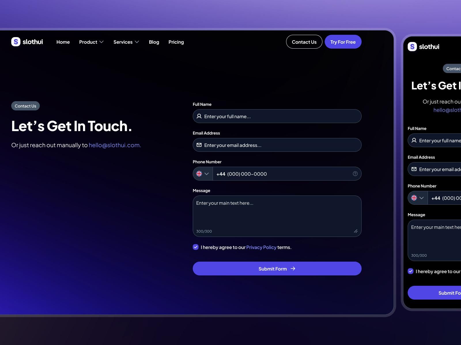
How to Design Better Website Forms: UX Principles That Improve User Experience
Website forms are one of the most important interaction points between a business and its website visitors.
Whether someone wants to contact a company, request a quotation, create an account or book a service, forms help users communicate their requirements and complete important actions.
However, a poorly designed form can create unnecessary frustration. Confusing labels, too many fields, unclear error messages and difficult mobile interactions can make visitors abandon the process.
Good form design is not just about arranging input fields on a page. It is about understanding what users want to achieve and making that process as simple as possible.
In this article, we explore practical UI/UX principles that help businesses create better website forms.
1. Keep Forms Simple and Focused
One of the most common form design mistakes is asking users for too much information.
Before adding a field, consider whether that information is genuinely necessary at that stage.
For example, a basic contact form may only require:
- Full name
- Email address
- Subject
- Message
Additional information can be collected later if required.
Why Simplicity Matters
A focused form helps users understand what they need to provide without feeling overwhelmed.
For businesses, collecting only relevant information can also make enquiries easier to review and manage.
Design tip: Remove unnecessary fields and keep the primary purpose of the form clear.
2. Use Clear Labels and Helpful Placeholder Text
Every input field should communicate exactly what information the user needs to enter.
Labels such as Name, Email Address, Phone Number and Project Details are easier to understand than vague descriptions.
Labels vs Placeholder Text
Labels and placeholders serve different purposes.
A label identifies the field and should remain visible even after the user enters information.
Placeholder text provides an optional example or additional guidance.
For example:
- Label: Email Address
- Placeholder: name@example.com
Avoid using placeholder text as the only field label because it disappears when users start typing.
3. Organize Fields in a Logical Order
The sequence of fields influences how users move through a form.
A good form follows a natural information flow.
For a project enquiry form, the sequence might be:
- Personal information
- Contact information
- Project type
- Budget or requirements, if relevant
- Additional message
- Submit button
Grouping related fields together helps users understand the structure.
For longer forms, consider dividing the content into clearly identified sections.
4. Make Form Validation Helpful
Validation helps users understand whether the information they entered is acceptable.
However, validation should guide users rather than interrupt them unnecessarily.
Use Clear Error Messages
Avoid generic messages such as "Invalid input."
Instead, explain the problem directly.
Examples:
- "Please enter your name."
- "Enter a valid email address."
- "Your message must contain at least 10 characters."
Show Errors Near the Relevant Field
Users should not have to search the entire page to identify an error.
Display the message close to the input field and make the error state visually clear.
Where appropriate, preserve the information users have already entered so they do not need to complete the form again.
5. Design for Mobile Devices
Many visitors access business websites through smartphones.
A form that works well on desktop may become difficult to use on smaller screens if its layout is not properly adapted.
Consider these mobile UX practices:
- Use a single-column layout.
- Make input fields comfortable to tap.
- Maintain readable font sizes.
- Provide enough spacing between fields.
- Avoid unnecessary horizontal scrolling.
- Use appropriate input types for email, telephone and other data.
- Keep important buttons easy to access.
Responsive form design should be considered during the initial design process rather than treated as a final adjustment.
6. Make Call-to-Action Buttons Clear
The submit button should communicate what happens when the user clicks it.
Generic labels such as "Submit" may work, but descriptive alternatives can provide more context.
Examples include:
- Send Enquiry
- Request a Quote
- Book a Consultation
- Create Account
- Submit Application
Use visual contrast to make the primary action easy to identify.
Also consider the button's loading and success states so users understand when their submission is being processed.
7. Provide Feedback After Submission
A form interaction should not end with a button click.
Users need confirmation that their information has been received.
A helpful success message might say:
"Thank you for contacting us. Your enquiry has been submitted successfully. Our team will review your message and get back to you."
Depending on the application, you can also:
- Display a confirmation page.
- Show a success notification.
- Provide a reference number.
- Explain what happens next.
Avoid displaying a success message before the server has actually confirmed that the submission was successful.
8. Improve Accessibility
Accessible form design makes websites easier to use for people with different abilities and interaction requirements.
Important considerations include:
- Associate every input with a properly implemented label.
- Support keyboard navigation.
- Maintain sufficient text and interface contrast.
- Make error messages understandable.
- Avoid communicating errors through color alone.
- Provide clear focus indicators.
- Use appropriate input types and autocomplete attributes.
Accessibility should be considered throughout the design and development process.
It helps create a more inclusive experience for everyone.
9. Use Conditional Fields Carefully
Some forms need different information depending on the user's selection.
For example, a creative agency enquiry form might ask whether a visitor needs:
- Website development
- UI/UX design
- 3D product rendering
- Interactive WebGL experiences
- Creative branding assets
Depending on the selected service, additional relevant questions can appear.
This approach is known as conditional form design.
It helps keep the initial interface simple while allowing businesses to collect more specific project information.
However, conditional fields should be implemented carefully so users do not lose entered information when changing their selections.
10. Test the Complete Form Experience
A visually attractive form is not necessarily a functional form.
Before launching a website, test the entire submission process.
Important Testing Scenarios
Functional testing
- Can users enter information?
- Does the submit button work?
- Are required fields validated?
- Does the form send data correctly?
Responsive testing
- Does the form work on smartphones?
- Are all buttons accessible?
- Is the layout readable on different screen sizes?
Error testing
- What happens when required fields are empty?
- What happens when the internet connection fails?
- Are error messages clear?
Accessibility testing
- Can users navigate using a keyboard?
- Are labels properly associated with fields?
- Are focus states visible?
Testing helps identify problems before visitors encounter them.
Common Website Form Design Mistakes to Avoid
Even a well-designed website can provide a frustrating experience if its forms are poorly implemented.
Here are some mistakes to avoid:
- Asking for unnecessary personal information.
- Using unclear field labels.
- Relying only on placeholder text.
- Displaying vague validation messages.
- Using buttons without clear action descriptions.
- Ignoring mobile responsiveness.
- Providing no confirmation after submission.
- Failing to protect forms against spam and abuse.
- Not testing the complete submission workflow.
Avoiding these mistakes can make website interactions more predictable and user-friendly.
Conclusion
Effective website form design combines simplicity, usability, accessibility and reliable functionality.
From clear labels and logical field organization to responsive layouts and helpful validation, every detail contributes to the overall user experience.
For businesses, a well-designed form can make it easier for potential customers to enquire about services, request information and take the next step.
At Visual Vertex Studio, we believe that great digital experiences are built around people. Thoughtful UI/UX design ensures that every interaction has a purpose and every user can navigate with confidence.
Planning a website or digital product? Explore creative website design and UI/UX solutions with Visual Vertex Studio.


